
For years we designed the desktop layout first, then squeezed it down for phones. That order made sense when most of a client’s customers still sat at a PC. It makes less sense in India in 2015, where so many first visits arrive on a small Android screen over an uneven connection.
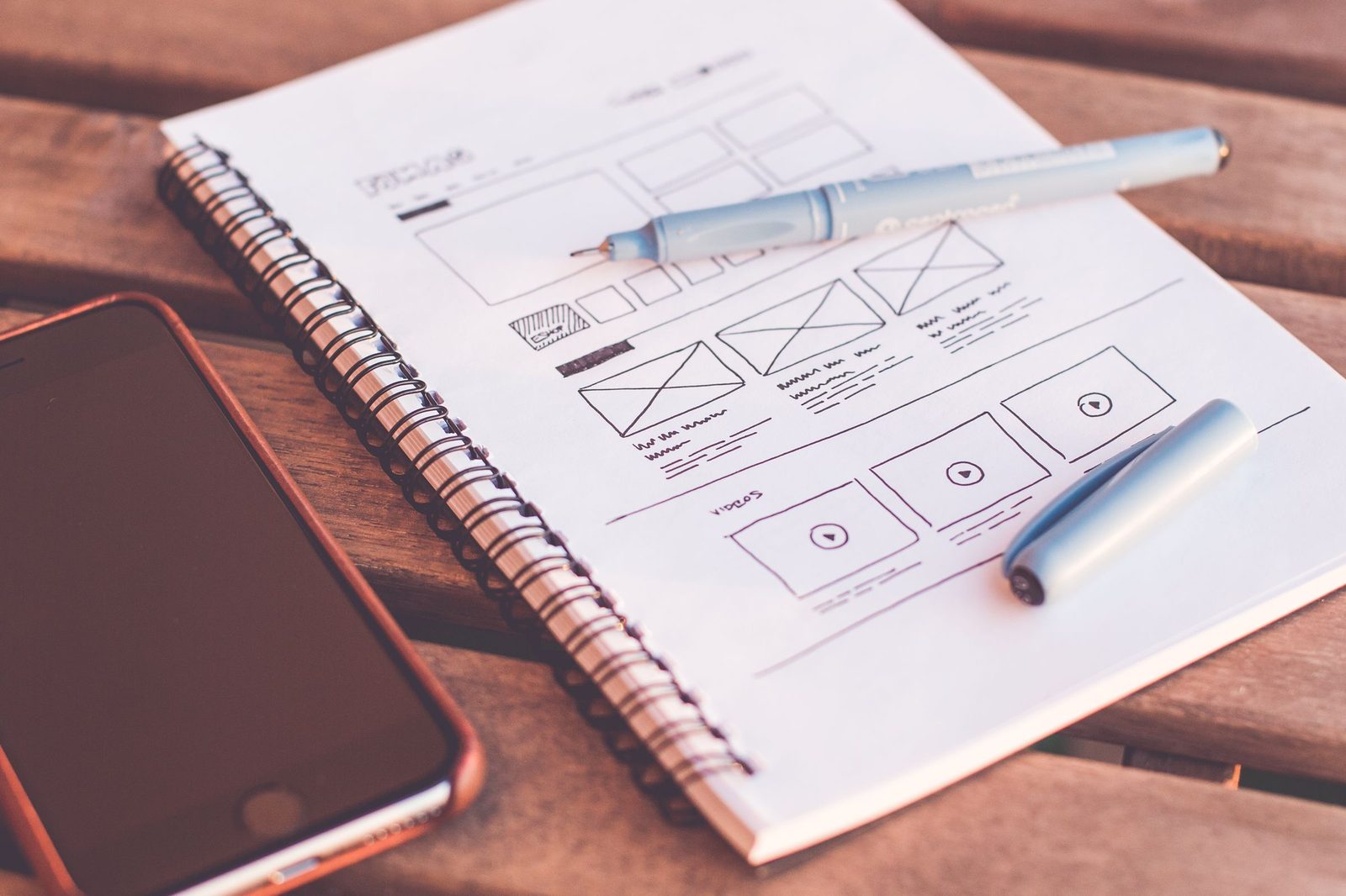
So we changed our own process. We now start every website project on a phone screen. Desktop comes second. Clients see wireframes the same way. This post is about that shift toward mobile first web design in our studio, not a claim that we invented the idea.
What changed outside the agency
Google’s mobile-friendly labelling and ranking signals made slow, fat pages painful to ignore. Analytics for our clients kept showing the same story: a large share of sessions on phones, high bounce when the menu was tiny or the click-to-call was buried.
Owners still review designs on their laptops. Their customers often do not. If we only ever present wide layouts, we approve a site that fails the real device. Waiting until “mobile polish” week to discover the booking button sits under a sticky bar wastes everyone’s time.
How the new process looks
Discovery still covers goals, offers and content. Then we sketch the home and key inner pages at phone width first: header, main action, proof, contact. We ask what a person can do with one thumb in the first fifteen seconds.
Only after that path feels clear do we expand the layout for desktop. Extra space becomes breathing room and secondary links, not a dumping ground for every brochure paragraph.
Development follows the same bias: responsive templates, sensible image sizes, tap targets that work, and forms that do not punish autocorrect. We test on mid-range Android phones on ordinary connections, not only on a fast office Wi-Fi laptop.
What clients notice
Reviews now happen on a phone held in the meeting, or on a shared screen showing a phone frame. Arguments move from “make the logo bigger on the wide banner” to “can someone book from this screen without pinching.”
Some clients worry that desktop will look empty. It does not, when the content hierarchy is honest. It looks calmer. The phone version stops being an afterthought that breaks the week before launch.
Content writers feel the change too. Headings and paragraphs have to work in a narrow column. That usually improves the desktop copy as a side effect.
What we are not doing
We are not building separate mobile URLs for ordinary marketing sites when one responsive site will do. We are not stripping brands down to a single button and calling it modern. We still care about desktop users who compare, print or fill long forms.
We are also not promising rankings. Mobile-first process improves usability and removes obvious technical own-goals. Search results still depend on many other factors. A fast phone site with thin content still underperforms a clear site with real answers.
Why we are writing this down
Agency News posts are how we record changes in how we work. This one matters because it alters every kickoff. If you hire us for a site in late 2015, expect the first layouts to look like a phone. That is deliberate.
Start where your customers stand. Right now, for most of the businesses we serve, that is a hand holding a phone. We would rather argue about the first screen that most people actually see than polish a wide hero that only the meeting room projector shows well.
The process will keep evolving as devices and networks change. For this year, mobile first is the default in our studio, and desktop is the expansion, not the starting gun.
Internally we also changed how we estimate timelines. Mobile-first wireframes need real content earlier, because you cannot hide weak copy behind a wide collage. That pressure is useful. It forces decisions about offers and phone numbers in week one instead of the week before go-live.
Clients who still need a print-led brochure site can have one, but we will still show them the phone path first. Most of their enquiries will arrive that way whether the brand feels traditional or not. Meeting the customer on the device they hold is ordinary service now, not a trend pitch.